
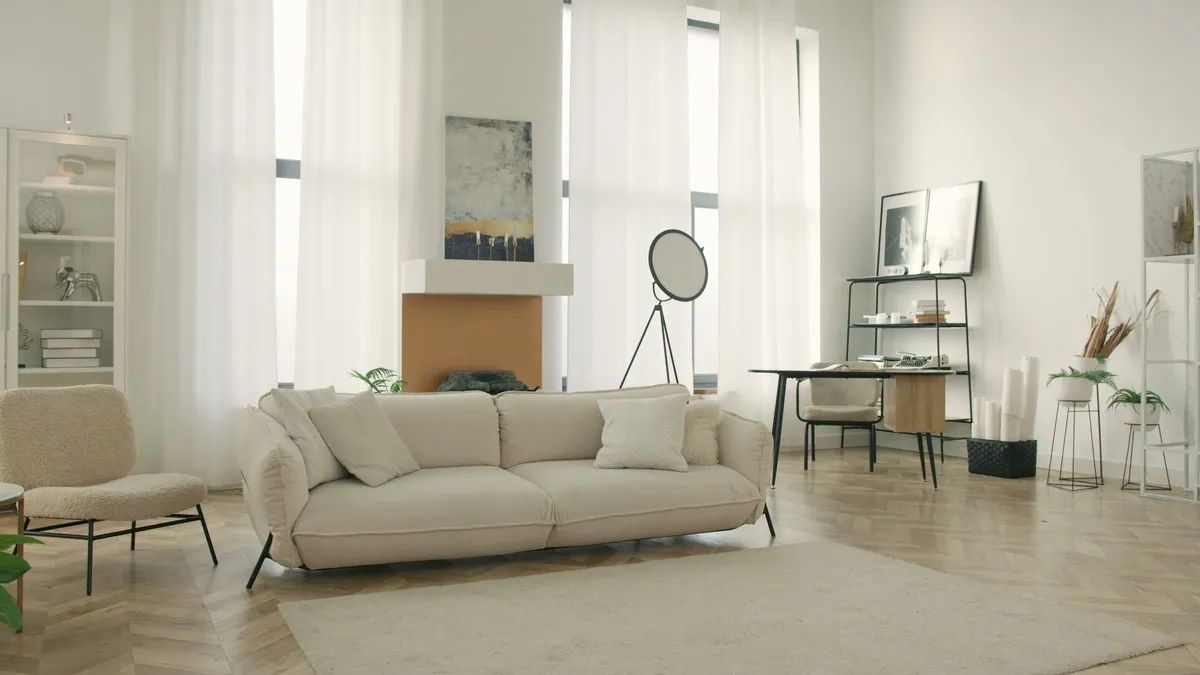
A white sample can look just right by the living room window while you are making breakfast. Hold it up in the same place after dinner and the paint may seem much creamier. That moment is worth paying attention to. In Vancouver, the summer gives you far more time to look at colour in daylight than the winter does. The white that works for your home is the one you still enjoy under the conditions in which you actually use it.
Work out where the light comes from and when you see it
A north-facing room often receives softer indirect light. Beside a cooler grey surface, a white with a little warmth might feel more comfortable. A west-facing room can look subdued early in the day and receive warmer direct light later when the sky is clear. Before making a decision ask whether the window actually gets that light. Trees, an overhang or another building can change what reaches the wall. For central Vancouver, U.S. Naval Observatory calculations put the time from sunrise to sunset at about 16 hours on June 21, 2026, and about 8 hours on December 21. The view from your own window tells you what the room actually gets.
Write down when you spend time in the room. For a west-facing living room, compare the samples in late afternoon and after the lights go on. In a home office, look from the desk during your first and last calls. A white that looks gentle by the window may read slightly blue on the wall that appears behind you. An overcast day gives you a third chance to see how it looks as the daylight changes.
Choose one surface that will not change
A warm oak floor, a cool stone counter, a painted door frame or a large sofa can give you a starting point. Warm whites may lean cream, beige or yellow. A cooler white can pick up grey or blue. A fairly neutral white gives you a third comparison. Put them right beside the old trim. At that boundary you may see an undertone that did not show in the middle of the wall.
For a living room with oak and linen, try a soft off-white and a quieter neutral. For a kitchen with cool grey quartz, try a neutral white and a cool off-white, then check them beside the under-cabinet lighting. If you want a little colour in a study, place the white next to a muted grey-green, slate blue or another shade you already like. A West Coast home can borrow colour from timber, stone or the greens outside, but the room’s fixed materials give the best place to begin.
Paint the test big enough to live with
Use movable sample boards or manufacturer samples that give you enough area to judge. Set one close to the window and one on a wall farther from it. Move each sample to the other position before deciding. In a room that opens onto a kitchen, look back at the living room from the countertop. See whether the two spaces still feel related with the selected whites.
Compare test areas once in daylight and again with everyday lights on. Observe the right sheen as well as the right colour. The same colour on a matte wall and a satin door can look different as they pick up light. Where a surface gets touched often, compare both the appearance and the cleaning guidance for the product. Our guide to testing paint colours at home gives more ways to set up this comparison.
Once you have a favourite, take away the other boards and leave that one up on its own. Side-by-side comparison is good at revealing undertones, but living with one colour for another evening can tell you whether it is comfortable on its own. Note which light was on when you liked it best.
Keep a short record for the estimate
Take a room photo, write down the two or three leading samples and identify what will stay. Note the wall, ceiling and trim plans separately. Keep the brand, colour code and sheen once a choice is made. If you want help choosing within an interior repaint, bring the boards to your free on-site estimate. Mayda can look at the colours beside the materials you are keeping and discuss how that choice works with the surfaces you plan to refresh.